
3:8 My Website/App for HW
- Rahima
- Mar 22, 2019
- 8 min read

I started with designing the home page of my website. As mentioned in my branding blog post I finalised my designs with Steve's help.

I wanted to make it like a gallery, so I added some artwork from Hackney artists and went with the idea of having just a grid of artist's work without their names, sort of like hidden doors, so that when you click on an art piece you learn more about the artist, see their other work and possibly buy one that you like. I decided to go with the name 'Artists of Hackney Wick' as it's straightforward and lets you know the purpose of the website straight away and will appeal to artists - who are my target user.


I then designed the typeface.


Because I wanted a hand drawn look for the title, I literally drew out the title on my phone and screenshotted the image and uploaded it to illustrator to trace over. I tried different variations of the title with my fonts and letters and made sure all repeating letters are the same and tested it on my homepage.
I was then reminded of the fact that all the fonts I saw on storefronts in Hackney itself all use block, capital letters. So I redesigned my typeface and refined all the letterings and tested it on my homepage and resized it to fit the page. I liked this version much better and it actually felt a lot more Hackney than my previous typeface as Hackney is raw and cursive letters don't exactly scream raw.


Next, I applied my colour palette to my homepage and tried out different colours before settling on blue, purely because I just thought it felt right as Hackney has a sense of gloominess which I think comes through with the blue.


Next, I decided to go back to my type and use the other colours on a few of the letters from my palette to bring it alive and previewed it in XD. I wanted to have a colour consistent for the beginning of each word in the title (except the 'of') as I may want to shorten the title to just AHW for my app and so having the consistent colouring would link the app logo to my website logo.


I then began my second page which would be an artist profile page which opens up when you click on the first artwork in the grid on the homepage.
I chose brown as the background colour for this page and added a picture of the artist on the left side of the webpage, taking up 1/3 of the entire page and having the information about the artist on the right side taking up 2/3 of the page. I didn't focus on the font for the text just yet as I wanted to do all the profile pages and then apply major decisions all at once later. I then previewed it on XD and was okay with the outcome so went ahead and created another profile page on illustrator using the same elements as the first.


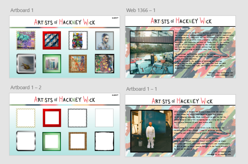
I then thought about navigation and how users would know how to get back to the homepage from the profile pages. So I designed arrows for users to click as a navigation tool. Unfortunately, I didn't know how to create an arrow shape in illustrator so I drew one and coloured it in and copied it in to XD but it didn't copy right and the way I coloured it came out rough looking but it kind of fit in with my artist aesthetic so I kept it like that. I also realised that I can't just have 8 boxes and call it a day. Hackney would obviously have more artists, so I copied and pasted my homepage for now and added the navigation arrows for users to click and view more artists.


I then remembered Abi mentioned that the website needs to involve the community more so I added a 'Join' feature for aspiring Hackney Wick artists to submit themselves and their work to be displayed on the website. This also reiterates that my overall message is for artist recognition. I put the 'Join' button on the top right corner of all the pages and when clicked it would open a page that informs the user on how they can submit themselves to be displayed.


I then showed some members of my class what I had done up until now and Junaid and Jacob both said that they thought my arrows were flags and that it wasn't clear that they were arrows. I explained that I didn't know how to get an arrow shape in illustrator, so Junaid showed me and then I replaced my drawn arrows with actual arrows.


I also changed my backgrounds to be gradients instead of solid colours to make it look less like a powerpoint presentation and more like a real website.


I showed Abi everything I had so far and she told me to experiment more with the profile page and make it so that it's more personal to the artists. I decided to change the background for the profile page and used my colour palette to create something that looked like paint swatches on Microsoft Paint. In my blog posts from IKON, I mentioned that I can't draw. This is relevant here again as my creation turned out not so great so I took it in to photoshop and applied an oil paint filter on it, lightened it and liquified it to look like running paint. I then applied it to one of my profile pages to test what it would look like and, honestly, I did not hate the outcome. I thought it was quirky and artistic.


I now finally decided to pick a font for all the text. I chose a font style at first that looked kind of arsty and quirky but after applying it, it just looked really amateur so I changed it to a more professional but still applicable font - SimSunExtB.


I also changed the border of my pictures from the grey from my colour palette to all black because the grey didn't look right.

I also made my artwork in the grids clickable so that they lead to the artist profile page. My arrows also go to the next page and my 'Join' button goes to the join page. I also made it so that when you click on the logo at the top, you are taken back to the homepage, as I realised that users may not see the arrow if it is so small in the corner and assume that the logo itself would be a navigation tool.


I showed my work to members of my class at this point of time and Jack mentioned that I could play around with the art in the grids more, like possibly adding borders. I thought this was a great idea and was reminded of what Abi said about personalising to the artists, so I put a different border for every 8 squares. I also decided to use my colour palette in the order of the 7 squares, thinned down and stretched out, beneath my logo to separate the elements of the pages from each other.


I also changed my pictures from stock images from Google to actual photographs that Sidney took of people from Hackney to represent my artist persona's.

I also changed my 'Join' button to say 'Submit' instead for clarification and got rid of the arrows after Sam mentioned that he almost always clicks a website logo to go back to the homepage and realised I could apply this logic to my website.


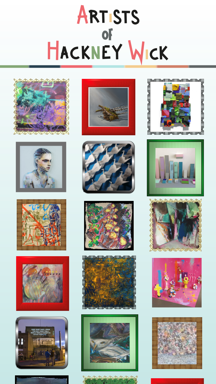
I decided to make my home page one page with a scroll feature rather than multiple pages that the user has to click through, for convenience and ease.


I then changed my backgrounds from my Microsoft Paint paint swatches to the gradients but kept with the personalisation theme and decided each artist would have their own coloured gradient background.

I then realised I hadn't even stuck with my original plan of having the website be a place for artists to sell their art. Abi recommended me a website named Saatchi Art that sells artwork so I looked at their interface as inspiration for mine. I then cut down the texts for my artist profile pages and extended the page so that it is scrollable and placed the text beneath the photo of the artist. I then used the right hand side of the page to display all the artwork with prices to show that they are buyable.


I was originally going to just have the first 8 boxes filled with artwork but then I thought that this seemed lazy so I filled up all the boxes with artwork on my homepage

This is what my website looks like at this moment of time:

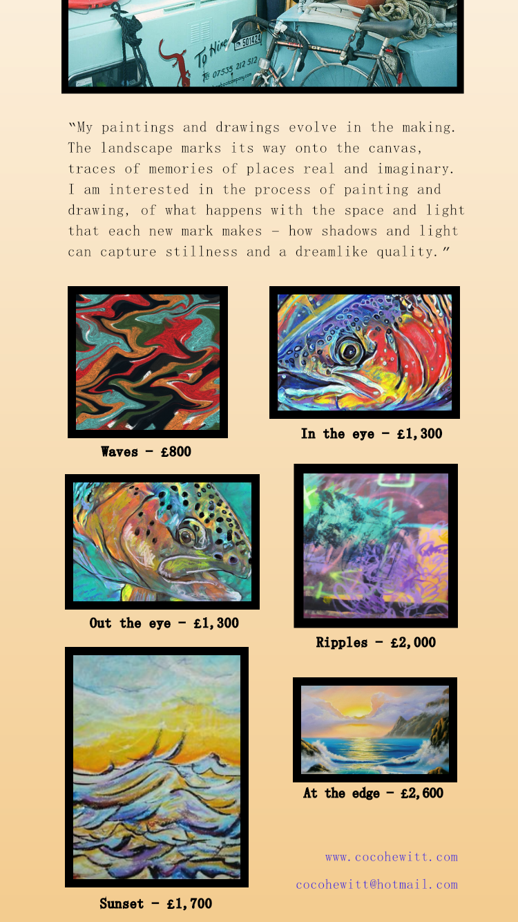
Next, I made the buying page for users to buy a piece of artwork from an artist. I again used Saatchi Art as inspiration. I began with having the artwork picture and the text and price squished in the upper left corner and realised this looked bad and fixed the layout. I made the page scrollable and added a 'Buy Now' button that originally had black text on a white background but I changed it to blue so users can recognise that it's a link to purchase the art. This reminded me to make the contact info of the artists blue so that they represent hyperlinks.


This is what my website looks like at this moment of time:

I now began prototyping and designing my app.
I copied my logo from my website homepage and rearranged it so that it would fit for an app and added my gradient background and boxes. For my profile pages, I just used the letters AHW from my logo as I mentioned earlier in the post that I made the 3 letters all the same colour so that they would still link to the original logo. I also linked the logo on the profile page back to the homepage.


I then added all the info and artwork from the profile page on to the app and filled up the homepage with all the same boxes from the website. I then changed the font for my 'submit' button to match my text and added it to the bottom of my app homepage.


I tested everything for my app that I had created so far through preview mode on my iPhone https://streamable.com/zrjiv and found that the boxes on the homepage should be bigger and more spread out to make the artwork more visible. So instead of 3 boxes per row, I changed it to 2. I also made the submit button more bolder. The text on the profile pages, especially the contact info, needed to be bolder as they are too thin to read on the app and each art work should take up the entire screen rather than share the space as they do on the website since the app condenses the amount of space you can use. If I was looking to buy artwork, I'd want to be able to see it clearly before I decide to buy it.


I made these changes to the app and made my final page for the app, which was the page to purchase an art piece.


And retested these changes on my phone: https://streamable.com/93dtl
Our class then presented what we had for our protoypes so far to Derek and Craig from Visit Britain but because I joined the session late, I was unable to present, sadly, so I instead showed my class members my work and got their feedback. Basically everyone I spoke to said my work was good but they could've just said that to be nice. Some said that my 'Buy Now' link looks too outdated and like a Windows 8 clickbait link and that my text on the purchase page wasn't formatted properly. I took in to account this feedback and made changes to my work. I made the 'Buy Now' button more sleek and modern looking and made the background the same grey from my colour palette.


These are my final website and app designs:


And my final tests of the prototypes:
Website - https://streamable.com/96r86
App - https://streamable.com/l5bk7


Comments