
Phillip Apeloig
- Rahima
- Mar 12, 2019
- 2 min read

To prepare for our type workshop, we were asked to research about a typographer and I chose Phillip Apeloig as his work stood out a lot to me because of the disjointed letter style.

Phillip Apeloig is a French typographer and worked as a graphic designer in Amsterdam, Paris and LA in the 1980s. In Rome, 1993, he researched and designed typefaces and won the1995 Tokyo Type Directors Club’s Gold Award for his font ‘Octobre en Normandie’. In the late 1990s, he worked as a design consultant for the Louvre and eventually became art director until 2008 while teaching typography on the side from 92 to 98.

I really like that the font has an unfocused effect to it and can help portray connotations of mystery and uneasiness.
Aelpoig has won many awards, such as, the Overall Prize at the 2009 International Society of Typographic Designers Award in London. In 2010, He designed the posters for the “Yves Saint Laurent” exhibitions at the Petit Palais.

I love the use of colours in this so much and the way the Y S L connects in the middle through the red - amazing.
In 2016, 2017 and 2018, he designed a poster for the Art History Festival.


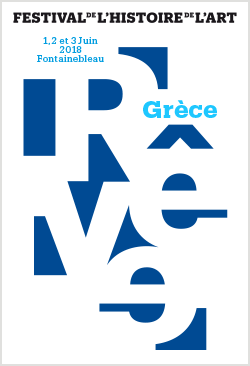
I like how all three posters share similarities but are so different. They all use block letters on a solid background but they all use the spaces of the poster differently. The 2016 poster is my favourite and sort of reads like a waterfall with the first R having so much priority, so you read it downwards and sidewards to the bottom. It's also really interesting that he's chosen to put the exhibition info inside the letters rather than on the background as it's not a stylistic choice I would've thought to make but works really well. I also really like the 2018 one and how the letters are formed from the empty background spaces. Seeing type posters like these really inspire me to approach and experiment with different ways I can use letters to create words.

Another piece of work by him that I really liked was this 2018 New Year card he created, solely because the 8 looks like an upside down fish.


Comments