
8:14 Poster Ad and Copy + New Website
- Rahima
- Mar 19, 2020
- 2 min read

We all had to make a launch campaign visual for our products/service
Here's what everyone (minus my groups) made and notes on how to make a good one:


As I mentioned when doing the copy for the conference, I want to improve my copywriting skills so before making a poster, I wanted to fix the copy.
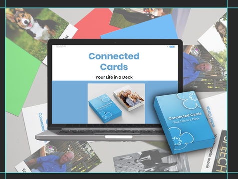
Currently my copy reads: Title - 'Missed Match' Tagline 'Missed a Memory?'
No one mentioned anything about having a better title but after asking around, the title is okay but the tagline can come across a bit rude as it might be seen as taking the piss as people with dementia obviously can't remember their memories, so I should change it to something more friendly and appropriate. Tab almost mentioned in the last presentation feedback that the tagline needs work.
I opened my suitcase of research again and pulled this helpful bad boy out:

I brainstormed new names and taglines:


My new copy reads: Title - 'Connected Cards' Tagline 'Your Life in a Deck'
My creative rationale for the name is that the cards connect in different ways depending on how you play, but you also build connection with loved ones while playing. For the tagline, like the research states, I didn't want to make it difficult to understand or too cheeky, it had to be something they'd get straight away. I think 'Your Life in a Deck' does that. It states what the game is: their life, their memories, the people and things that mean the most to them in a card deck. I also like 'Bringing memories back, one match at a time' so I might stick that in somewhere.
For the call to action, I was debating between 'Buy Now' 'Shop Now’ 'Connect your Cards now' but again, it's best to just keep it simple so I stuck with the good ol' 'Buy Now'.
Next, I made the poster ad. That research suitcase was pretty full but I managed to pull yet another gem out of it:

I also saw this ad on the tube home from uni after Steve's ad making lecture, what a coinky dink because it was an ad for a website and my product/service also happens to showcase a website

But first, I had to fix the damn website. Which also meant fixing the mockups on the website:


Here's the new and improved website with big clear fonts, with no capitalised words, only words with capitals at the start and nice colour contrast:

Now finally, the poster ad. Here's some inital inspo:


I thought it'd be cool to add the website with some cards laying around so here's my development:


Here's the final poster ad:


Comments