
8:3 Teaming up
- Rahima
- Mar 14, 2020
- 2 min read

Updated: Mar 19, 2020
I spoke to Larry and we casually discussed the brief and our ideas for the conference and found that both of us were doing the same concept of water so we decided it would be better to team up and work together than work alone.
So I showed Larry the mockups I made already and the feedback I got as well as my moodboards and he shared some of the mockups he'd done with me as well:


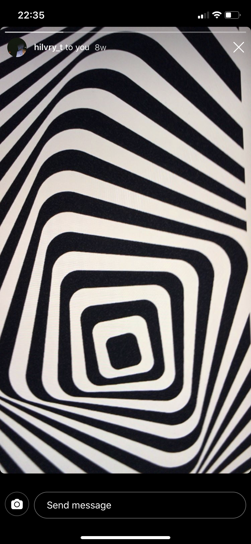


I liked this paper cut out style he did and it reminded me of waves so we decided that waves could be our iconography for the conference and to visualise our insight.
We made a moodboard of different visual styles of waves:


I also did some research into waves themselves to see if I could find any useful information and came across these charts that shows the relationship between waves and wind but visually the way the graphs looked stood out to me and Larry.
I also watched some videos on youtube to find out any more information on water itself and anything we could use for visual inspiration.

There was something in the atomical structure of liquid that was interesting to me so I made some quick sketches of another visual route we could go

But Larry reminded me to not be so literal about it like Steve had said, so I decided to drop this idea.
We felt we had enough visual research to make a new mockup but not enough research for the conference itself and it's actual branding.
We found some graphs on the target audience of conferences as initially we wanted a young audience but weren't sure if they would even attend:

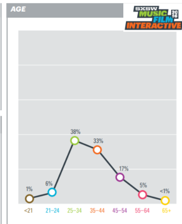

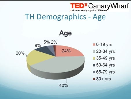
We confirmed our target audience to be young adults and adults under thirty as conferences seem to be popular for that demographic. We also wanted it to be open to the public and have a fun friendly but accessible tone of voice with broad content so we didn't overwhelm them with too much information
From our visual research we decided for our colour palette to consist of blues as they obviously work well with water. So me and Larry had a go at making a mockup each.
Larry worked on visuals:


I looked at fonts and layouts. I made a moodboard of the layouts I liked:

For the font for our poster I wanted something with rounded edges instead of sharp corners to mimic water and found this one named CoconPro which I thought fit my description.


I made a quick mockup with the text and showed Larry

He said it'd be interesting to use reflection with the text so I had a go


Larry also made another visual mimicing the Thames as the conference was at Ravensbourne, which is right by the Thames.

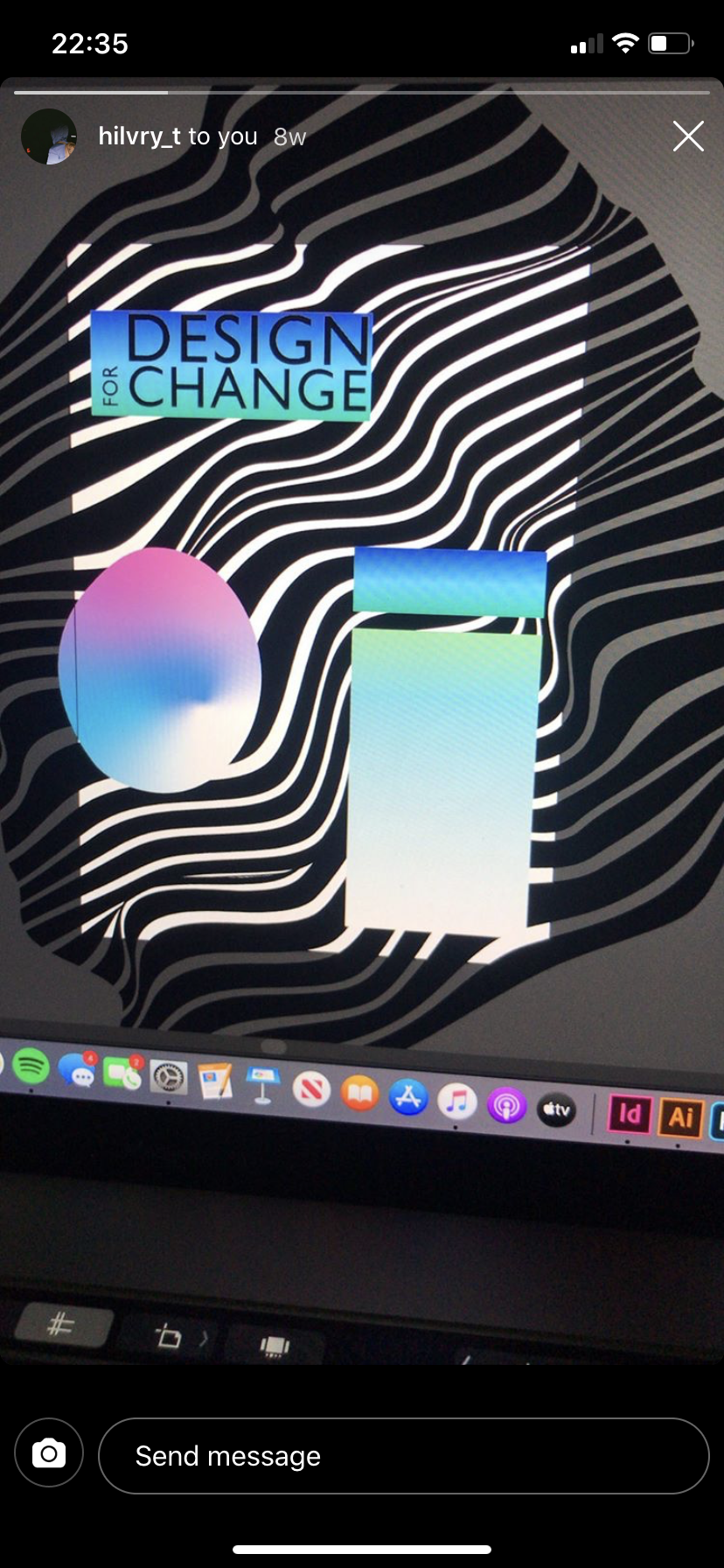
So using all the visuals we both had a go at making some mockups
Larry made these:


I made this:


I used the ideas of the liquid atoms again to use for the way the text is laid out on the poster So rather being straight and centre, it’s off centre like liquid atoms.
We then made a final mockup for our poster:

And different activations through an email invite and Instagram post:


Comments