
Part 1 - Design for Change; 8:1 Conference Branding
- Rahima
- Mar 12, 2020
- 3 min read

Updated: Mar 19, 2020
For the first lecture of the year 2020, we were introduced to our new brief which was to design the identity and launch materials for a conference on behavioural change.
To begin, we had to understand what the hell behavioural change even meant. You see, people fast and slow think, fast thinking is instinctive like 1+1 is 2 which you don't need to think about. But slow thinking is the opposite, it's taking your brain through a process of information to reach a conclusion.
Artists and designers can change behaviour through subtle processes that elicit an emotional response from an audience through their fast brain, introducing a new wave(I assume) of advertising that uses subtle design to achieve results.
In the past, advertising was quite straight forward. Derek showed us some examples of straight forward ads from the past vs subtle ads from the present.

But I'm reading a book that touches on this briefly named 'Hey Whipple, Squeeze This' so I want to impart the knowledge that this book has imparted to me on to my blog for all 1 of my readers. Below are screenshots of extracts from the book:

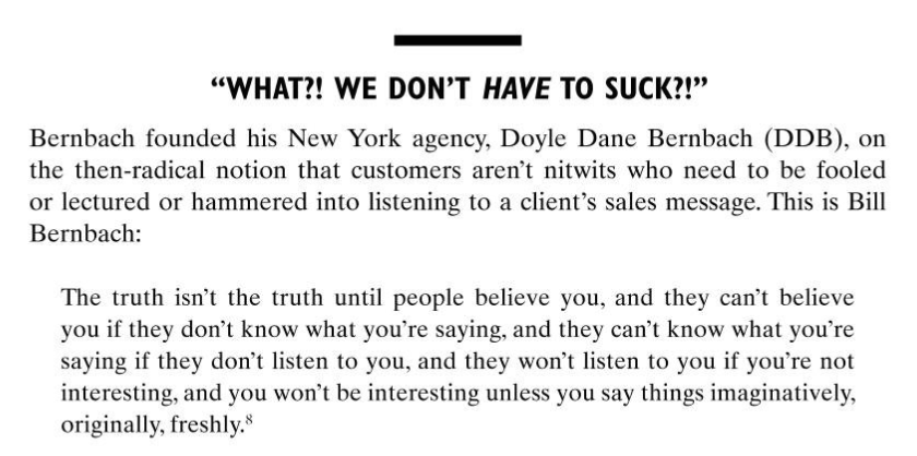
The book also references Helmut Krone from DDB's 'Lemon' ad as a good reference to subtle advertising and fun fact, my first blog for uni was on Helmut Krone and another fun fact, he was a pretty cool guy.

For part 1 of this unit we had to work in teams so Steve made us do a team exercise which was wild to say the least. We stacked marshmallows with spaghetti sticks to see who could make the tallest. I worked with Diane and Amy and we did okay.

ANYWAYS! The conference we were going to design the branding for will be on 13 March 2020 @ The Walker Space at uni, named Design for Change. Exciting stuff.
To really dig deep and understand how we could illustrate what behavioural change is we took a look at examples of change such as behavioural nudges. One example is on Netflix after you finish watching an episode, the countdown to the next episode with the autoplayer is a nudge to keep you watching/using the service. Another example is the search bar on Google when you type and it autotypes a search suggestion. These nudges all want to predict what your behaviour will do and change or nudge it to benefit the service in a subtle way using your fast thinking so its instinctive behaviour to follow the nudge.


Another example is the use of technology to encourage behavioural change such as AI or VR. VR Health Institute is a service that has created video games for your VR headset that encourage health and fitness, changing your behaviour to exercise more while gaming.

More examples of behavioural nudges:

The class also put up anything and everything to do with behavioural change on the wall including examples, information and visual ideas for the conference.

We then had to think of ideas and an insight that could form the basis of the identity for the conference. After I read this sentence I was very confused and began to think of examples of behaviour changes that would be used as the conference identity such as a behavioural nudge conference. Spoiler! That was the wrong thing to do lol. It's about the concept of behavioural change and not an example of it. What does behavioural change LOOK like?
Who is the audience of our conference? Our tone of voice for it?
I began by looking at examples of conferences and how they are branding themselves:


You can see the personality of these conferences through their online presence, for example, CES focuses on consumer technology which you can see through the graphic on the website with different technological devices like the car, the apple watch, the game console. This is how they are visually showing their personality. The conference website for the 2017 Women's Summit illustrates their professionalism and strong stance. For the One Young World conference, the type and colour choices convey that their audience is for a younger demographic, especially when compared to Women's Summit, you can tell the difference in tone of voice through visuals. For the Forward Festival website, they use the iconography of an arrow around the website, so repeated visual cues are also something I should consider using.


Comments