
One Day Briefs; 4:1 Reverse Adgineering (Oatly)
- Rahima
- May 6, 2019
- 4 min read

Updated: Jun 14, 2019
For our third term, we were told we would be given five one day briefs to challenge. Derek really put emphasis on research being key in advertising and told us four different points we would need to remember for each brief but also in general:
1. Research/understanding your subject.
2. Finding an insight/truth.
3. Creative proposition/illustration of your idea.
4. Creative direction/tone of voice.
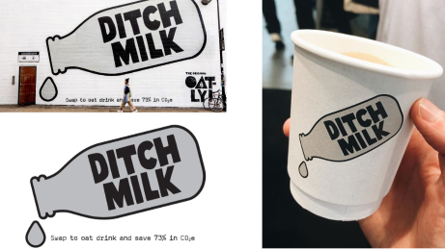
For the first one day brief, we got into pairs to tackle ‘Reverse Adgineering’. We were given a brand and a campaign to reverse adgineer – meaning we would find out which agency created the ad, examples of the ad in print/video/online, what the insight, creative proposition and creative direction was and present this to the class. I worked with Emily on this task and we were given the brand 'Oatly' and their campaign 'Ditch Milk'. The campaign's message is to encourage people to ditch animal milk and drink oat milk as a healthier and better for the environment alternative.
Me and Emily decided to split up the list and research on our own and then come together and share what we found. I took on what agency, finding examples of the ad and the tone of voice and she took on the insight and the creative proposition/direction.
What I found out about the agency was that Oatly used an out of house agency and that this Ditch Milk campaign was actually apart of a bigger campaign. The campaign was designed by Oatly’s in-house creative team but was planned by PHD Manchester and OOH specialist Talon. Ben Harris, Account Director at PHD Manchester said that “Out of home has been the ideal way to bring this campaign to life, providing a perfect vehicle for the client’s creative idea and effectively provoking conversations with consumers,” “With a challenger brand like Oatly, there’s no point in being shy – we wanted to be sure its message was as disruptive and in-your-face as it could be to ensure maximum impact.”
PHD are a 30 year old media agency who plan, buy and measure media. They were a punky start-up and are now one of the Top 5 agencies in the UK and have won UK’s ‘Media Agency of the Year’ eight times this decade.
In terms of the ad visuals, they used the same image and tagline online and in print.


Like Harris said, they wanted Oatly to be distruptive and in-your-face to really get their point across. The visuals are simple and straightforward to persuade you to drink an alternative to milk and so they don’t need extra unnecessary visuals or flashy colours that could distract you from their primary message. They’re transparent as a brand which supports their message.
This is an extract from their campaign website.

The tone of voice used is conversational, confident and cocky - three C’s (and none of them are for Cow). They counter the argument that cow’s milk is something we have historically always drank before that argument has even been made by sceptical audiences – they’re confident in their product and their ethos to save 73% of C02e(emission). They have an air of superiority in how they talk and back it up by saying The Guardian have said that by adopting a vegan diet, you can reduce climate impact. They challenge consumers to ditch milk and try Oatly instead for 72 hours, because if you can do it for 72 hours, chances are you can do it for a lifetime.
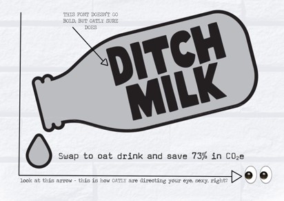
What Emily found was that their insight is that they know they’re doing the right thing and if others feel guilty for drinking milk from an animal then they know they’re right too. Oat milk is a better, healthier alternative to cow’s milk. In terms of creative proposition/direction, she found that the campaign is direct and blunt. It gives Oatly a rebellious appearance and shows them as the underdog fighting for a sympathetic cause and the voice for change. The typography is their brand logo font, written in all caps, with a heavy weight - the visual identity of Oatly is there - slightly wonky, approachable, friendly - with a more commanding presence. The imagery of the bottle is slanted, housing the text within, and the line weight is lighter than the typography, making the text the main feature of the image - from the mouth of the bottle is a drop of milk that is perpendicular to the copy. The copy is the informative part - they’re telling you to ditch milk, and then directing your eye so you can see WHY you should ditch milk.
This is our presentation (slides read left to right):


What I learnt from this brief was how to go backwards from a final outcome and learn how it got to it's final form and what behind the scenes stuff was involved in the making. I really enjoyed this as I often do wonder when I pass by an ad how it came to be.


Comments