
4:3 Hack the Format (Fanta x Kings Cross Tunnel)
- Rahima
- May 9, 2019
- 5 min read

Updated: Jun 14, 2019
Xavi led our third one day brief and introduced us to the idea of hacking a format. He showed us an example of how someone hacked Spotify by uploading a silent album called Sleepify. Spotify counts a song as a 'play' after 30 seconds of listening time, so the creator, Vulfpeck, encouraged users to play it while they slept so they could earn money from the album. The creators had 8 tracks, which names ranged from Z to Zzzzzzzz, and it earned them $20,000 before Spotify realised what they had done and took it down from the platform.

Following this example, We got in to small groups and Xavi gave us a challenge. brand and a format. I worked with Emily, Jacob and Sam and we got given Fanta and Kings Cross Station's Light Tunnel. The challenge was to disrupt the format in a surprising and unexpected way, with a message that is consistent with the brand’s positioning. The hacking of the format should add more meaning and creativity to the message of your campaign idea.
Sam was away for a short while so me, Jacob and Emily began by researching to understand the brand's positioning and main message and to analyse the format to understand in detail its features, location, context, how an audience consumes it, etc.
Some info about the tunnel: “It is one of Europe’s longest light-walls and was created by The Light Lab and Spiers+Major. The tunnel has a gentle curve and the walls are lined with repeating panels, backlit with LEDs, along the full 90m length so there are no shadows. It was created to create a soothing, relaxing journey and the flooring has long triangles in ceramic tiles to echo the ‘fin’ sections above. The tunnel is open to pedestrians Monday to Sunday from 7am until 8pm.”
I looked at what commuters had to say about the tunnel on Instagram. The tunnel is viewed positively and a popular place for Instagram lovers to take pictures of because of the soft, colourful florescent lights.


I also looked at ads that had already occupied the tunnel wall by Dell and Nike. They are able to showcase a lot of visuals in one space because of how lengthy the tunnel is so that's something that we could think about when later creating our ideas and mockups.


Some info about Fanta: There’s over 100 flavours worldwide and 75 in Japan alone. They have their own unique bottle shape called the ‘squash’ bottle. It's owned by Coca-Cola and they use a soft sans-serif font giving it a fun and playful aesthetic.
We juggled some ideas around and thought of advertising Japan’s 75 flavours in the UK and displaying them on the panels of the wall, this is an example of a hack because we aren’t advertising one flavour across the wall, it’s multiple using each panel which isn’t usually done. We could possibly use sound alone and not the wall as a visual or we could somehow making the station floor interactive to the wall. We could also make the actual wall interactive using the built-in LED feature.
Emily, Sam, Jacob and I agreed on three ideas, the first was having each panel be one of 75 flavours and the station calling out the sounds of the flavours as you walk through it.
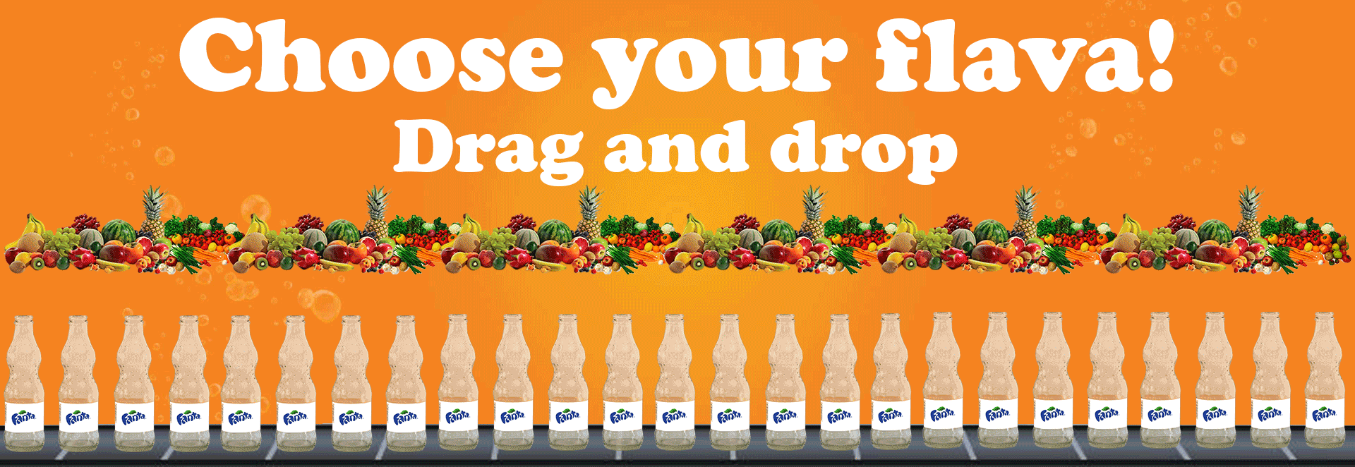
The second was having the wall be interactive where commuters passing by can drag and drop ingredients to make their own customised Fanta flavour.
The last was having tiles placed on the station floor and when a commuter steps on one, a panel will show a cut off image from a larger image, almost like a puzzle of a new Fanta flavour. So the idea is that when all the tiles are stepped on, aimed at rush hour, you complete the puzzle which would reveal a new flavour.
Sam created a mood board of already existing Fanta ads for inspiration for idea one and another moodboard for ads that have done a similar concept of flavour choosing.


The insight for this was to allow Britain to create it's own unique flavour of Fanta that you can't find elsewhere, as every flavour in Britain is available in other countries but not vice-versa. For our finished outcomes for insight one, we used orange because it's well known to Fanta and a font similar to the one they use. So essentially, commuters would be able to use the tunnel wall like a touch screen, select a fruit and drag it to a bottle and a unique flavour will be created. We chose the phrase 'Choose your flava' because Fanta uses the word flava instead of flavour in their own ads, so we felt it was only right to follow them in their choices.


Emily admitted she isn’t confident in creating visuals so she made a recording for the 75 flavours using an ad from Japan for Fanta: https://soundcloud.com/e-rubin/75-fanta-flavours-audio
This is what the audio would sound like in situ: https://soundcloud.com/e-rubin/75-fanta-flavours-audio-w-footsteps
This insight for this was to overwhelm the audience with the variety of flavours from another country, as the newly released grape flavour from America got positive feedback when it was being tested here.
I had a go at creating the puzzle tiles mockup. So when a tile is stepped on, the wall reveals a puzzle piece that would reveal a new flavour. The insight for this was that if the British public want to know what the new flavour is, it would be entirely up to them to find out because they would need to directly interact with the tunnel and the brand to know, making them feel included. In my mockup, as you can see, commuters have stepped on a tile and it has lit up simultaneously with a puzzle piece on the tunnel wall that shows a snippet of the new Fanta flavour in it's bottle.


I got feedback from Steve Spacey for my work and he said right off the bat that the font paired with the orange colour scheme reminded him way too much of easy jet and I need to change it to differentiate easy jet from Fanta. He wasn't wrong:

He also said I needed to improve on the visuals because they weren't clear and didn't communicate the idea properly. I also need to change small things like having singular fruits shown and less bottles to make it less cluttered overall.
I also did some more research into Fanta's font that was designed by a company called Koto. The typeface was described as "pretty great and perfectly executed, capturing the feel of cut paper and neatly digitized."


I also looked at the illustrations and identity used by Koto for Fanta and decided to incorporate them into my new mockups. The colours they use are soft but vibrant and the illustrations reflects on their intent to be playful and natural with the animated fruits, which doesn't come through with our usage of real fruits in our first mockup.


This is our new finished mockup:

I used the same typeface and fruit images from Koto and attempted at a fun background using some of the colours from the Fanta flavours. I realised it was a little ridiculous to expect commuters to drag and drop an ingredient from one side of the tunnel and walk all the way to to the bottle. So I minimised the amount of fruit choices there are and had them closer to the bottle and changed the concept to selecting a fruit which would trigger an animation creating a new flavour visually.


To make my puzzle tiles mockup more clear. I decided to make it so that when a tile is stepped on, text appears on the wall that reads 'a puzzle piece has been revealed!' to make commuters realising that stepping on a tile has triggered a reaction on the wall.


This task required me to think outside the box as a lot of the original ideas were campaign ideas merely using the wall as a canvas but then I realised I wasn’t hacking it, I was just using it. I definitely learned to broaden and go further deep with my ideas from this workshop.


Comments