
4:4 Sunday Service (Billie Eilish x Happy Hour)
- Rahima
- May 9, 2019
- 4 min read

Updated: Jun 14, 2019
For the fourth one day brief, I was absent so I got my friends to let me know the task. It seems that the class were all given a workshop by Steve Spacey who gave everyone a celebrity and a phrase to choose from to create an album cover.


I decided to pick Billie Eilish and the phrase Happy Hour because from what I know of Billie Eilish is that she’s quite creepy and gives off emo vibes and so I thought it would be cool to put an almost sadistically happy twist on her image.
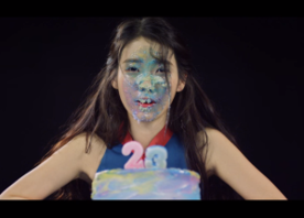
I didn't know how to include the hour from happy hour in to my cover as you can't use the phrase's original meaning but I remembered this K-Pop music video I watched called 23 by IU: https://www.youtube.com/watch?v=42Gtm4-Ax2U
In the music video, IU celebrates her 23rd birthday and goes on a weird, quirky Alice in Wonderland acid type trip and then smashes her face in to her birthday cake.


My insight was that because Billie Eilish is creepy, I recreated the meaning of happy hour to mean sadistic birthday party.
I created a mood board of other references similar to the music video that I thought would work for my album cover. Luckily, being a fan of K-Pop, the genre dabbles in a mix between happy and borderline disturbing so I had a lot of reference material.

I also created another moodboard for Billie to see what her personal style is like.

Plus a final moodboard for the birthday theme and colour palette which consists of vibrant colours and darker colours to show the contrast between my take on happy hour and Billie’s image.

This is my final outcome for the album cover:

I used yellow as the wall background because Billie associates herself with a lot of yellow as you can see from my moodboard. I added a happy birthday banner to make the birthday theme clear but made it incomplete to show that there's been perhaps some recklessness going on. I got an image of a smashed birthday cake and photoshopped cake pieces on to her face to make it look like she smashed her face in the cake similar to the IU music video. To fit in with the theme, I added the blood hand prints on the table because Billie's music talks a lot about murder and death so I wanted to include an element that could convey that. Also, you can't see her hands in the shot so it's quite funny to assume her hands got cut off which is why there's blood and why she ate the cake face first. I used a font I found online that has a blood on the walls look - I originally had it black but then I wanted to make it red to fit in with my colour palette but I couldn't change the font colour for some reason so I had to go over it with red pen but I think the untidiness of it fits in well. I added the shadowed balloons last minute because I felt like there needed to be more to show the party theme and because without them it felt quite empty but I think the fact that they're shadowed adds an element of mystery almost.
Unfortunately, being absent means you miss out on important details such as the fact that you can't feature the artist's image on the album cover. I was told this after I showed my friends my outcomes. I redid the cover and removed Billie and resized some of the elements but I still feel my version of sadistic happy hour is conveyed.

I presented my blog to Steve Spacey and he, thankfully, really liked my idea despite me being absent for his star pitch. He said that I should change the happy birthday sign to say 'happy hour' and get rid of the 'happy hour' text. The original happy birthday banner didn't have the letters to make out the word 'hour' so I had to play around with some of the letters to make them look like 'hour'. I also darkened the balloons because I didn't think they came through as clearly as I wanted. Lastly, I resized Billie's name to fill up the empty space left when I removed the original 'happy hour' text.

Steve also told me to extend my work to creating merchandise which was apart of the brief originally. Damn, don't miss class kids, you'll regret it!
I took a look at what Billie has done for her merchandise before to mimic her style - if she has one.

For her album 'When we fall asleep, Where do we go?', her merchandise had a lot of references to sleeping because of the album name. So I thought I could play around with the party theme and create some merchandise related to that. I used the bloody hand print and put it on a paper plate and cup which could be used as party cutlery.


I also decided to create party confetti out of the letters in 'billie eilish' and 'happy hour'.


I also used the bloody handprint and her name on other typical merchandise pieces.

I really enjoyed this task and I wish I could’ve been there for the workshop to help better my understanding of the brief but my take away from this is that you can make anything work if you find a justifiable connection to begin with like I did with my interpretation of happy hour.


Comments